Resgatou — Au Q Mia
An end-to-end UX project, from research to a clickable prototype, for an app on responsible pet adoption, care and animal-abuse reporting, built in the Cubos Academy UI/UX Design Specialist program.
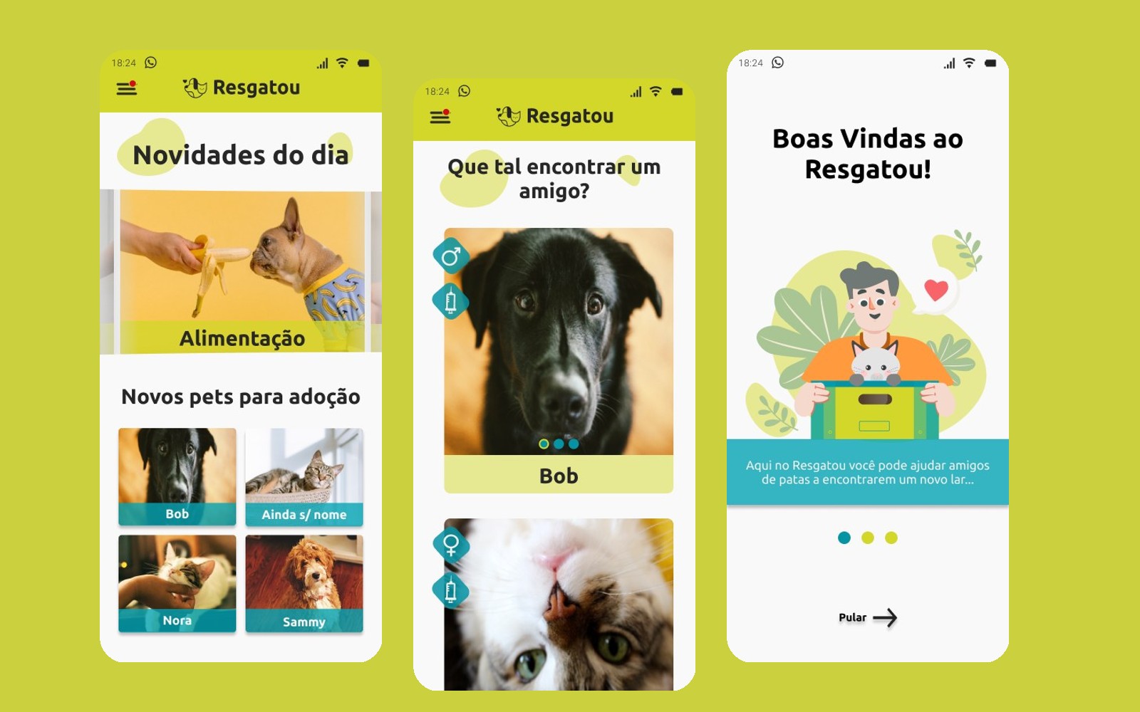
STAGE 01Context and goal
Capstone of the Cubos Academy UI/UX Design Specialist program, built as a team in 2023. Resgatou is a mobile app that brings together responsible pet adoption, reliable care information, sponsorship and a channel to report animal abuse in one place.
I worked as a UX/UI Designer on the team, across the research board in Miro and the screens in Figma.
STAGE 02Challenge
Brazil has thousands of abandoned animals and overloaded NGOs, while people who want to help run into confusing processes and scattered information. The project's central question: how might we make responsible adoption and animal care easier by connecting adopters, owners, NGOs and specialists?
STAGE 03Discovery and research
I combined desk research, an online questionnaire and semi-structured interviews with NGOs and with pet owners (30–45 minute scripts, with recording consent). General goal: identify what leads people to adopt, how adoption processes work and how well people know about reporting channels and NGOs.
CSD matrix: what we know, assume and don't know
Certainties
- Animals suffer from abandonment and abuse
- Law 9.605/98 (art. 32) makes animal abuse a crime
- The RGA pet registry is mandatory by law in São Paulo
- Websites exist to report abuse
- “Green December” is the awareness month against abandonment
Assumptions
- Older animals are abandoned more easily
- Adopting a pet can improve the adopter's mental health
- People don't report because the process is complicated
- People prefer adopting younger pets (puppies and kittens)
- Campaigns raise awareness
Doubts
- What is the main reason for abandonment?
- What is the average cost of adopting an animal?
- Do people prefer dogs or cats?
- Do people trust NGOs?
- How can a report be more effective and answered faster?
The matrix separates facts, hypotheses and questions. Assumptions and doubts became the script for the questionnaire and interviews, instead of deciding the product by gut feeling.
Questionnaire: 57 responses
- 57answered the questionnaire on NGOs and animal rescue
- 96.5%have a pet at home (55 people)
- 83.6%report a positive experience with the pet's arrival
- 27.3%of the pets were bought, not adopted
Interviews: affinity diagram
Rescue
- Few people know more than one reporting channel
- All interviewees have helped NGOs (donations, volunteering or support)
- Most animals rescued by individuals are puppies or seriously injured
Adoption
- Many consider the animal's size and available space before adopting
- Some pets were returned to the NGO due to adaptation problems
- Most have adopted more than one animal, to give them company
Care
- Most have reliable support to look after the pet when they travel
- All hold a favorable view of neutering
- Some allow street access, with reports of cats that got lost
STAGE 04Synthesis: persona, empathy and value proposition
Findings were synthesized into a persona, an empathy map and a value proposition canvas, aligning what the app offers with what the user needs.
Ayla Queiroz Martins
20 years old · Veterinary Medicine student and intern
“My purpose is to be the voice and the shelter for those who cannot speak for themselves.”
About
Passionate about animals since childhood, she has plenty of hands-on contact and care knowledge. She likes sharing content and, when she can, mediates responsible adoptions.
Habits
- Reads a lot about pets
- Creates and shares care content
- Animal-welfare advocate
- Rescues and re-homes animals
Goals
- Ensure animals' health and quality of life
- Pass on knowledge in a practical way, to the right audience
Channels
- Social media (including WhatsApp)
- Blog
- Podcasts
Pains
- Lack of resources to care for the animals she rescues
- Hard to find qualified adopters
- Low engagement on her articles
Sees
- Abandoned animals in the neighborhood
- Overcrowded shelters
- People who prefer to buy rather than adopt
Does
- Rescues and treats animals
- Shares videos and care tips
- Volunteers at shelters
Hears
- “You alone won't make a difference in the world”
- Stories from people who adopted and had good experiences
Thinks
- Abandoned animals need care and love
- It would be great to have a system that made finding available animals easier
Needs
- Provide proper medical care
- Help abandoned animals find a home
- Get help from other people engaged in rescue
Value map (the app)
Products and services
- Articles on animal care
- Community of specialists
- Showcase of pets up for adoption
- Donations and sponsorship
- Real-time reporting
- Adopter–animal compatibility
Gain creators
- Connect with new friends
- Fight misinformation among pet owners
- Fight abandonment and abuse
- Make it easier to connect animals and adopters
Pain relievers
- Connect the user to street animals in need
- Promote sponsorship and donations
- Responsible-adoption mediation, with screening and post-adoption follow-up
Customer profile (Ayla)
Gains
- Be able to present animals available for adoption
- Create reliable care content
- Keep an engaged community
Pains
- Worry about costs and about irresponsible adoptions
- Lack of help with street animals in critical condition
- Overcrowding and lack of support at NGOs
Jobs to be done
- Share her own experience
- Follow NGO campaigns
- Read content about pets
STAGE 05Definition and architecture
Pain points became How Might We questions, grouped into three axes that organize the app: reporting and rescue, adoption and care.
Reporting and rescue
How might we increase the effectiveness of reports?
How might we popularize reporting channels?
How might we make helping and donating to NGOs easier?
Adoption
How might we encourage people to adopt rather than buy?
How might we show the advantages of adopting older animals?
How might we reduce the abandonment rate?
Care
How might we raise awareness and help people neuter their pets?
How might we help owners find lost pets?
How might we keep people informed about animal laws and rights?
The first wireframes were hand-drawn sketches of eight screens (login, sign-up, home, my pets, swipe to adopt, details, care and profile). Later, research added reporting, chat, sponsorship and the adoption form to the navigation map.
- 01Welcome
- 02Login / Sign up
- 03Home: news
- 04Adopt a pet (swipe)
- 05Pet details
- 06Adoption form
- 07My pets
- 08Care and articles
- 09Reporting
- 10Chat and sponsorship
- 11Profile
STAGE 06Identity and design system
The brand pairs a simple logo, a dog and cat sharing a heart, with a color system that conveys warmth and energy.
Color theory. The base is a monochromatic teal scale (hue ~187°, five tints from dark to light) that adds depth without new hues. The accent is lime (~63°), about 125° away on the color wheel, close to a triad: enough tension to draw the eye, yet harmonious because it sits next to natural green. Water and grass, calm and vitality. Green, red and yellow are reserved for function (success, error, warning), so the brand color is never mistaken for feedback.
- #008A98Dark tealPrimary buttons, cards and navigation
- #00AEBAMid tealBanners and highlights
- #A5E0E5Light tealForm and card backgrounds
- #CBD13ELimeHeader, brand and secondary actions
- #E5E891Light limePet cards and soft backgrounds
- #232323GraphiteMain text
- #F7F7F7Off-whiteScreen surface
- #2CA047GreenSuccess, adopted and completed
- #D40919RedError and required fields
- #EFD437YellowWarning and occasional highlight
| Pair | Use | Contrast | WCAG |
|---|---|---|---|
| Aa | Charcoal text on the lime header | 9.53:1 | AAA |
| Aa | White text on teal button | 4.13:1 | AA large text/UI only |
| Aa | Charcoal text on form background | 10.77:1 | AAA |
| Aa | White text on mid teal (banners) | 2.70:1 | fails |
| Aa | Dark teal as text on white | 4.13:1 | AA large text/UI only |
| Aa | White text on lime | 1.65:1 | fails |
Critical reading. Charcoal on lime reaches 9.53:1 (AAA), which validates the header and supporting text. White on the dark teal of the buttons sits at 4.13:1, right at AA. White on the mid teal of the banners (2.70:1) and on lime (1.65:1) falls short: in a production version, banner text would switch to charcoal or the background would darken to #00838C, which reaches 4.5:1.
Typography. A single rounded humanist sans-serif that matches the friendly tone, organized in a scale from H1 to H3, subtitle, text (16 and 14) and label, in regular and bold. Hierarchy by size and weight, never by color alone.
Font (Google Fonts): Ubuntu.- H1Find a friend
- H2Find a friend
- H3Find a friend
- SubtitleFind a friend
- Text 16Find a friend
- Text 14Find a friend
- LabelFind a friend
Component library in Figma, with variants and states:
- Buttons (primary, secondary, disabled)
- Text, email and password fields with show/hide
- Checkbox, radio and switch
- 3-step stepper
- Category tabs
- Category carousel
- Pet, article and My-pet cards
- Calendar
- Bottom bar with 5 destinations
- Side menu
- Pop-ups
- Star rating
- Filters
- Social sign-in (Google and Facebook)
Hex values sampled from the published final art; they may differ slightly from the original Figma tokens.
STAGE 07Interface and prototype
The screens apply design principles that support the end-to-end flow. Scroll sideways to see the app:
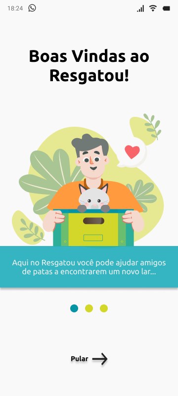
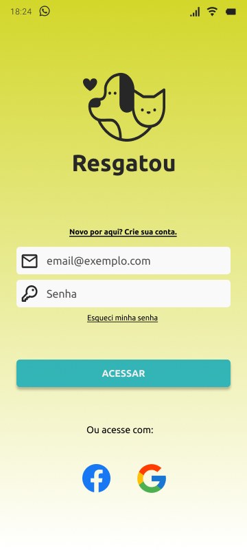
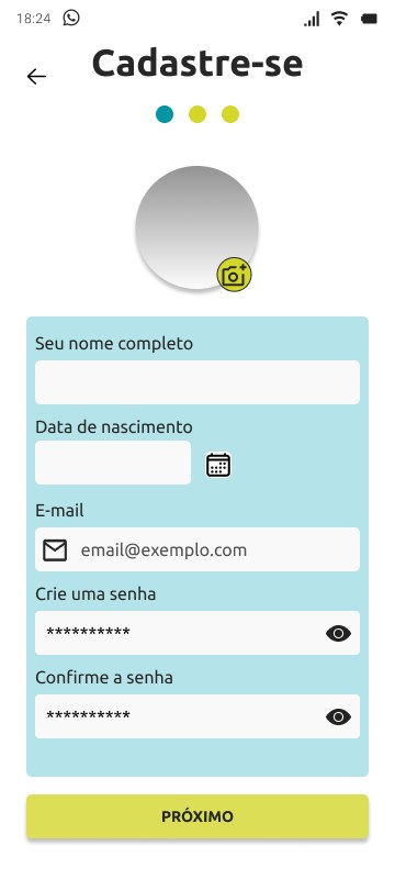
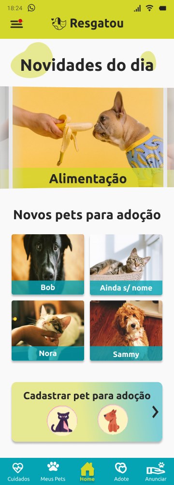
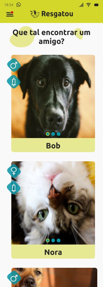
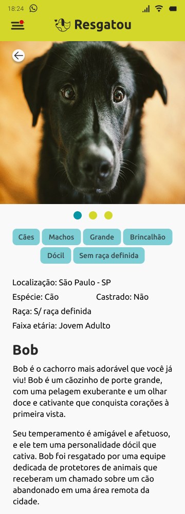
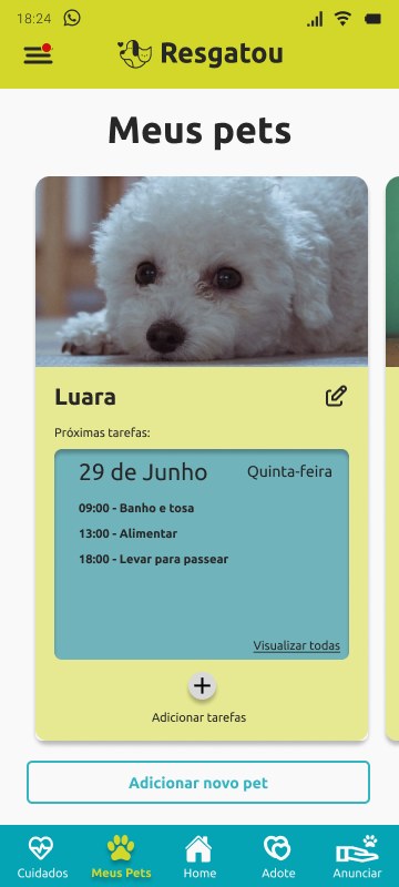
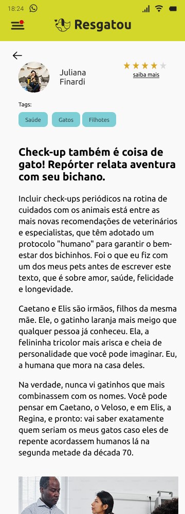
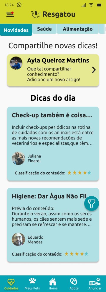
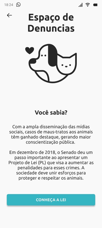
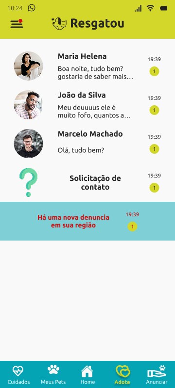
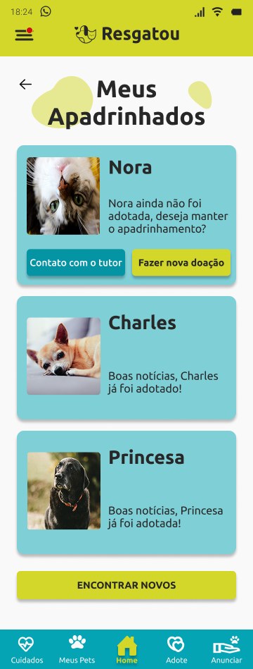
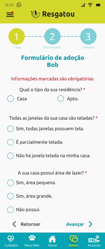
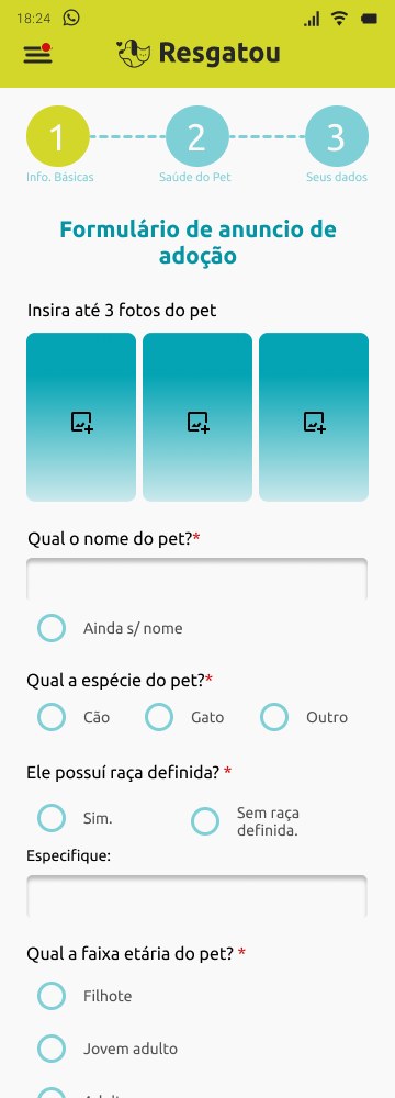
- Gestalt, similarity and proximity: pet cards share one structure (photo, name, lime strip), so they read as a group and are compared quickly.
- Visual hierarchy: large, emotional photos lead the adoption screen; filters and chips follow in the background.
- Progressive disclosure: the adoption form is split into 3 steps with a stepper, and so is sign-up, reducing cognitive load (Miller's law).
- Fitts's law and thumb zone: a bottom navigation bar with 5 destinations and wide buttons at the bottom of the screen.
- Recognition over recall: category tabs (Health, Food, Hygiene, Recreation) and consistent icons.
- Light gamification: swiping in “Adopt a pet” turns searching into discovery, and the task schedule in My pets builds a care habit.
The clickable Figma prototype links the screens of the main flows (sign-up, adoption, care and reporting).
STAGE 08Nielsen's heuristics applied
- Visibility of system status: steppers in forms, step indicator in sign-up and status in conversations.
- Error prevention: required fields flagged with an asterisk and in red, with options such as “No defined breed” and “No name yet”.
- Match with the real world: owner-friendly wording (neutered, age range, play area) and categories the audience already uses.
- User control: Back button in forms, Skip on the intro and social sign-in for faster registration.
- Consistency: components reused from the design system across all screens.
STAGE 09Accessibility and next steps
- Fix the contrast of white text on the mid-teal and lime banners (see the analysis).
- Review the size of supporting text in cards and forms, which is small for on-the-go use.
- Add screen-reader labels to icon-only buttons (bottom bar, filters, favorite).
- Validate adoption screening and the reporting channel with real NGOs in usability testing.
STAGE 10Outcome
The project delivers the full UX cycle: research (a 57-response questionnaire and interviews), synthesis (CSD, affinity, persona, empathy and value proposition), definition (How Might We and navigation map), a design system and more than 100 frames of screens, states and components in Figma, with a clickable prototype.