Home / Work / Natureza & André Cury
Natureza & André Cury — Site com IA generativa
A published site for an ENEM and university-entrance test-prep course in Natal (Brazil), built with generative AI support, focused on offer clarity and fast contact via WhatsApp.
STAGE 01Context and goal
A real, published site for a Natural Sciences test-prep course for ENEM and university entrance exams. The goal was to present the offer clearly and turn visits into contact, mainly via WhatsApp, the audience's natural channel.
The project shows how I use generative AI in the design workflow: from structure and copy to assembling sections, always with review and design decisions made by me.
STAGE 02Concept and visual direction
The concept is "trust with energy": navy blue for academic authority and orange for action and motivation. Teacher photography and result indicators reinforce credibility.
The page follows a simple funnel: a clear promise (H1), social proof, offer, differentiators, testimonial and a final call to contact.
STAGE 03Color theory
The palette is near-complementary: navy (~235°) and orange (~23°) sit on opposite sides of the color wheel, creating hue contrast and a natural highlight for orange, used only on CTAs and numbers. Blue conveys security and seriousness, orange conveys energy and urgency.
- #303675Azul-marinhoCartão principal, confiança e autoridade
- #E7630ALaranjaCTAs, destaques e indicadores
- #FFFFFFBrancoFundo e respiro
- #E1B091PêssegoApoio em ilustração e fotos
| Par | Uso | Contraste | WCAG |
|---|---|---|---|
| Aa | Texto branco sobre azul-marinho | 10.99:1 | AAA |
| Aa | Rótulo branco nos botões laranja | 3.39:1 | AA só texto grande/UI |
| Aa | Laranja usado como texto sobre branco | 3.39:1 | AA só texto grande/UI |
| Aa | Azul-marinho sobre branco | 10.99:1 | AAA |
Critical reading: white text on the buttons' orange sits around 3.4:1, acceptable only for large text. For small text, a slightly darker orange such as #C55409 would reach 4.5:1 without losing identity.
Hex values sampled from the published final art; they may differ slightly from the original Figma tokens.
STAGE 04Typography
Headings in a wide, heavy display face that gives personality and weight to the highlighted numbers, paired with a light geometric sans-serif for body text, keeping reading comfortable.
STAGE 05Layout, grid and hierarchy
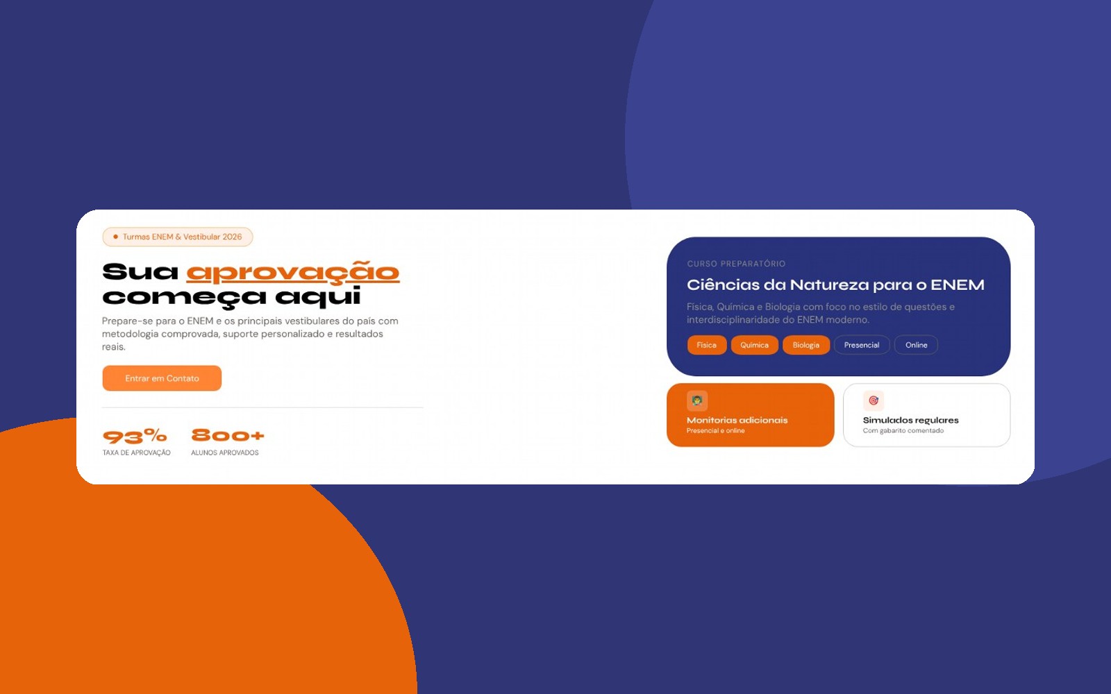
- Two-column hero: promise, text and CTA on the left; a blue card with the main offer (Natural Sciences) on the right, following the Z pattern.
- Social-proof indicators right below the CTA, large and in an accent color.
- Benefit cards in same-shaped blocks (similarity), differentiated by color to highlight the two main ones.
- Chips for subjects and formats: quick-read filters.
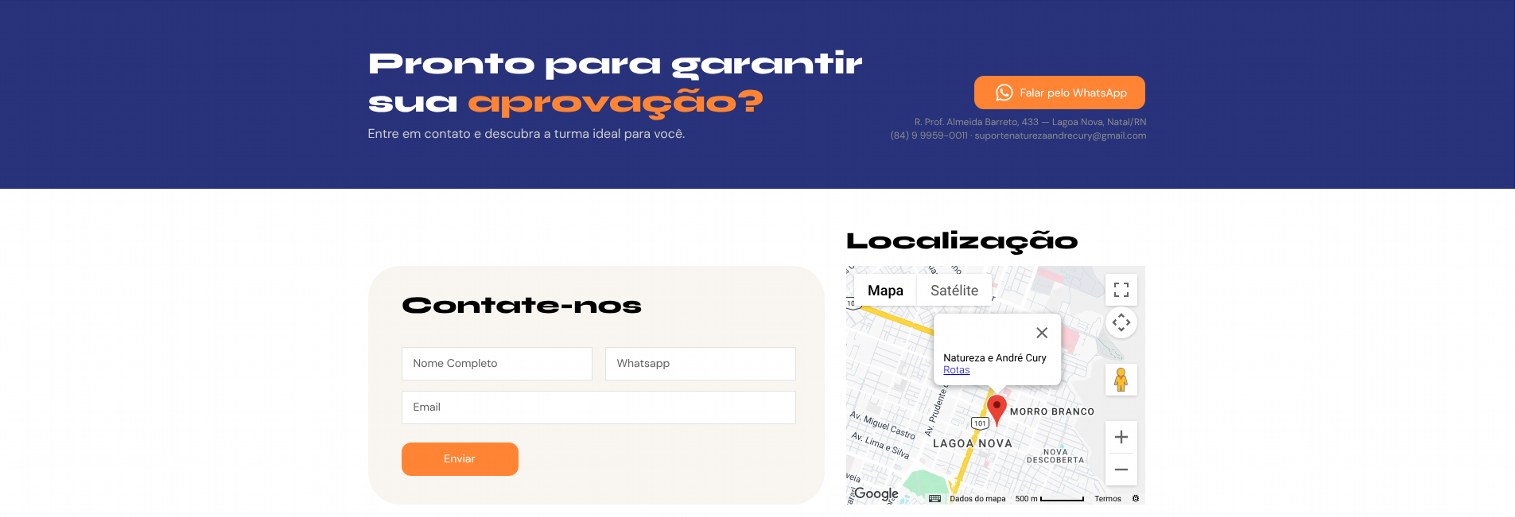
- Repeated CTA in the header, hero and footer, with a WhatsApp shortcut.
STAGE 06Heuristics and UX applied
- Friction reduction: WhatsApp contact and a short form (name, WhatsApp and email).
- Match with the real world: the audience's language (approval, mock exams, tutoring).
- Visibility and clarity: one H1 and one main action per screen.
- Responsiveness: a layout that reorganizes for mobile, where most of the audience is.
STAGE 07Proposed evolution
- Replace the card emojis with an SVG icon set, which renders the same on every system.
- Adjust the contrast of white text on orange (see the table).
- Add alt text to photos and labels to form fields.
- Measure conversion (WhatsApp clicks and form submissions) to guide A/B tests.
LinksSee the full project