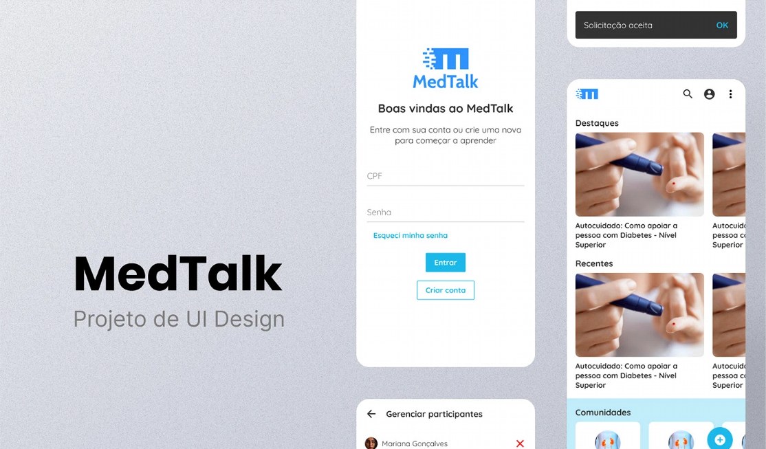
MedTalk — UI Design
A mobile app for health professionals to learn and connect in communities: sign-up, content, communities, member moderation and article publishing.
STAGE 01Context and goal
MedTalk is a mobile app concept for learning and exchange among health professionals (physiotherapy, nutrition, endocrinology, massage therapy and others). Users access content, join communities and publish articles.
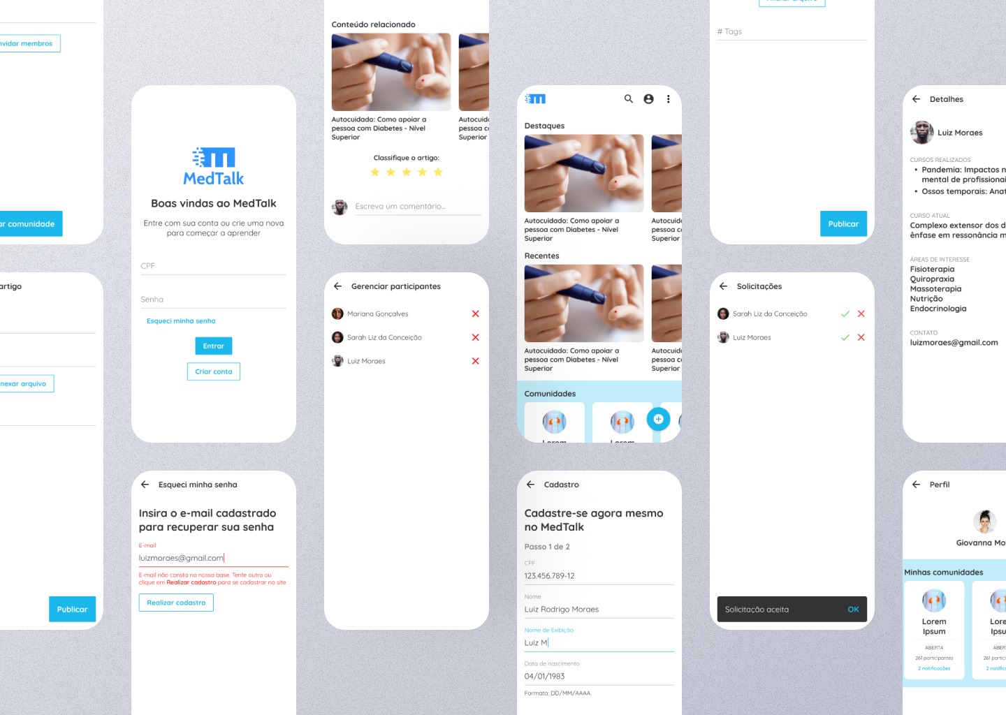
The project covers the whole usage cycle: authentication and sign-up, content discovery, open communities, member moderation, publishing and profile. It was published as a UI case study in Figma.
STAGE 02Concept and visual direction
The concept is "clinical, yet welcoming". White surfaces and generous white space convey cleanliness and trust, while a cyan-blue brings energy and humanity. Content photos (e.g. diabetes self-care) anchor the learning context.
The logo, an M with speed lines, signals conversation and knowledge flow and inspires the blue icons and highlights.
STAGE 03Color theory
The palette is analogous and cool (blue to cyan, neighboring hues between ~195° and ~205°), with neutral whites and grays. Blues and cyans are associated with trust, calm, cleanliness and science, which is desirable in healthcare.
Feedback colors follow conventions: green for accept/success and red for refuse/remove/error. In moderation actions, colors always come with an icon (✓ and ✕), avoiding reliance on color alone.
- #3C9DEDAzul de marcaLogotipo e destaques
- #18B7E8Ciano de açãoBotões, links e faixa de comunidades
- #FFFFFFBrancoSuperfície dos cartões e telas
- #221C2FGrafiteTexto principal (aprox.)
| Par | Uso | Contraste | WCAG |
|---|---|---|---|
| Aa | Texto principal sobre branco | 16.47:1 | AAA |
| Aa | Rótulo branco no botão Entrar (ciano) | 2.34:1 | não passa |
| Aa | Links em ciano sobre branco (Esqueci minha senha) | 2.34:1 | não passa |
| Aa | Azul de marca sobre branco | 2.90:1 | não passa |
Critical reading: the action cyan on white sits around 2.3:1, below the 4.5:1 minimum for text. For production, the primary action would move to a darker cyan (for example #1180A2, which reaches 4.5:1) while keeping the same brand feel.
Hex values sampled from the published final art; they may differ slightly from the original Figma tokens.
STAGE 04Typography
A pairing of two sans-serif families: a strong geometric one for headings and brand, and a rounded humanist one, friendlier, for the interface. Hierarchy comes from weight and size: section titles (Highlights, Recent, Communities) in bold, card text in regular.
Fonts (Google Fonts): Poppins for headings and brand, Quicksand for the interface.STAGE 05Layout, grid and hierarchy
- Horizontal carousels with the next card partly visible: the card cut at the edge acts as a scroll signifier, with no instruction needed.
- Grouping by labeled sections (Highlights, Recent, Communities): chunking per Miller's law, reducing cognitive load.
- Light-blue band for Communities: the background change creates a distinct common region and separates content types.
- Floating (+) button for the screen's main action, easy to reach with the thumb.
- Lean header with search, profile and menu: the essential shortcuts without clutter.
STAGE 06Flows and screens
- Login: ID number and password with line fields, a visible recovery link and two buttons of distinct weights: Sign in (filled) and Create account (outline).
- Password recovery with error handling: the red message explains the problem (email not in the database) and offers the way out (sign up), following the principle that an error should say what happened and how to fix it.
- Two-step sign-up ("Step 1 of 2"): splits a long form, shows progress and puts format hints (DD/MM/YYYY) in the field itself.
- Communities: cards with status (open), member count and notifications; member management and request screens with accept or decline and snackbar feedback ("Request accepted").
- Content: an article with related content, star rating and a comment field.
- Publishing: a form with tags and file attachment, with a primary "Publish" button.
- Member profile: completed courses, current course and areas of interest, giving professional context to the participant.
STAGE 07Nielsen's heuristics applied
- Visibility of status: sign-up progress (step 1 of 2) and snackbar confirmation.
- Error prevention and recovery: format hints and error messages with a way out.
- Match with the real world: industry language (completed courses, areas of interest).
- Consistency: primary and secondary buttons follow the same pattern on every screen.
- User control: a back arrow on every inner screen.
STAGE 08Accessibility and next steps
- Adjust the contrast of the primary action and links (see the table).
- Increase the size of supporting text on community cards, currently small.
- Ensure screen-reader labels on icon-only buttons (remove member, accept, decline).
- Validate the ID-number mask and the recovery flow with real users.
LinksSee the full project