UI Redesign: Banco Next
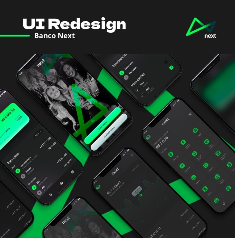
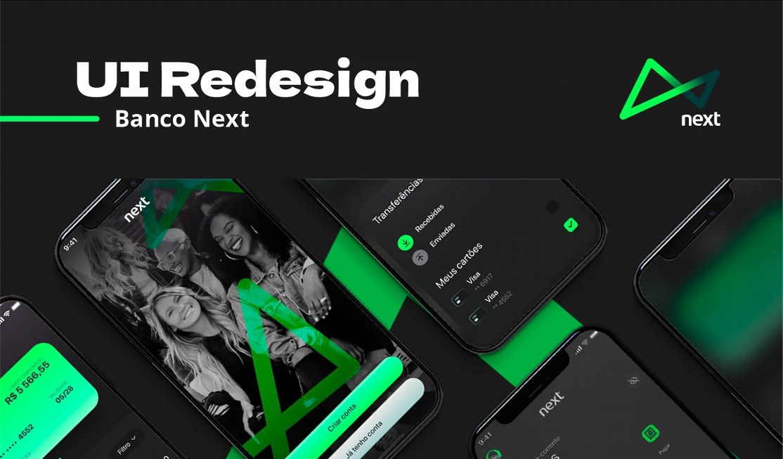
Redesign study of a digital bank's app in dark mode: information hierarchy, frequent tasks one tap away and a green-on-graphite visual system.
STAGE 01Context and goal
A personal UI study of a digital bank's app aimed at young users, for iOS. It is an independent exercise, unaffiliated with the institution, made in Figma and Photoshop.
The goal was to reinterpret the interface in dark mode, with the brand color as the only accent, and organize financial features so frequent tasks are visible on the very first screen.
STAGE 02Concept and visual direction
The concept is "money under control, without noise". A near-black graphite background and an electric green give the interface a tech-savvy, young feel and keep balance and actions in the foreground.
Screens appear in tilted mockups over green geometric shapes that echo the logo and add dynamism to the presentation without competing with the interface.
STAGE 03Color theory
The palette is a monochromatic scheme with an accent: nearly desaturated dark neutrals and a single, highly saturated hue (green, near 150° on the color wheel). The fewer colors compete, the faster the eye goes to what matters.
Green strongly signals money, growth and "approved", reinforcing the financial context. On a dark background, simultaneous contrast makes green look even more luminous, so it works as the focal point for icons, primary buttons and money-in entries.
- #1B1B1BPreto grafiteFundo base e superfícies
- #0DC561Verde neonAções, ícones de serviço e estados positivos
- #009A3CVerde de marcaFormas gráficas e ilustração de fundo
- #FFFFFFBrancoTexto principal e valores
| Par | Uso | Contraste | WCAG |
|---|---|---|---|
| Aa | Texto e saldo sobre fundo escuro | 17.22:1 | AAA |
| Aa | Verde neon sobre grafite (ícones, ações) | 7.53:1 | AAA |
| Aa | Rótulo escuro sobre botão verde (Criar conta) | 7.53:1 | AAA |
| Aa | Verde de marca usado como texto | 4.66:1 | AA |
Reading: neon green on graphite reaches AAA and white text has very high contrast. The darker brand green (#009A3C) only just passes AA, so it is used for shapes, not for body text.
Hex values sampled from the published final art; they may differ slightly from the original Figma tokens.
STAGE 04Typography
The presentation uses wide, heavy sans-serif headings with strong presence. Inside the app, typography is neutral and legible, with hierarchy created by weight and size rather than color.
- Balance and values: the largest text on screen, in strong weight, readable in half a second.
- Section labels: small uppercase with letter-spacing (e.g. SERVICES), acting as a subtle divider.
- Supporting text: light gray in a smaller size, for dates and categories.
STAGE 05Layout, grid and hierarchy
- Visual hierarchy: the balance sits at the top and is the largest element, followed by the service grid. The eye travels down the screen.
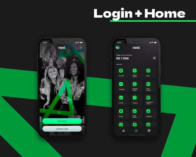
- 3-column grid: services (Pix, Pay, Transfer, My cards, Invest...) are equal tiles with icon and label. It follows the laws of similarity and proximity (Gestalt): what looks alike is read as a group.
- Fitts's law and thumb zone: the bottom navigation has only 3 destinations (notifications, home, settings), with large targets within thumb reach.
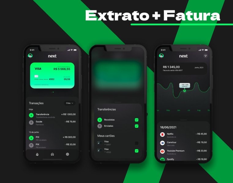
- Progressive disclosure: transfers and cards open in bottom sheets, keeping context and hiding details until needed.
- Common region: rounded cards group transactions by date (Today, June 13).
STAGE 06Flows and screens
- Login + Home: the start screen pairs a black-and-white photo with two buttons of different weights, Create account (green, primary) and I already have an account (light, secondary). Clear action hierarchy. On home, the balance can be hidden with the eye icon, a privacy concern in public spaces.
- Statement: a green-gradient credit card on top, a transaction list with an inflow icon (green) and outflow icon (gray), filter and scroll. Icons and +/- signs avoid relying on color alone.
- Invoice: the month's invoice amount, a line chart with a tooltip on the selected point and a list of subscriptions (Netflix, Spotify...) with date and value. The chart uses direct labeling instead of a separate legend.
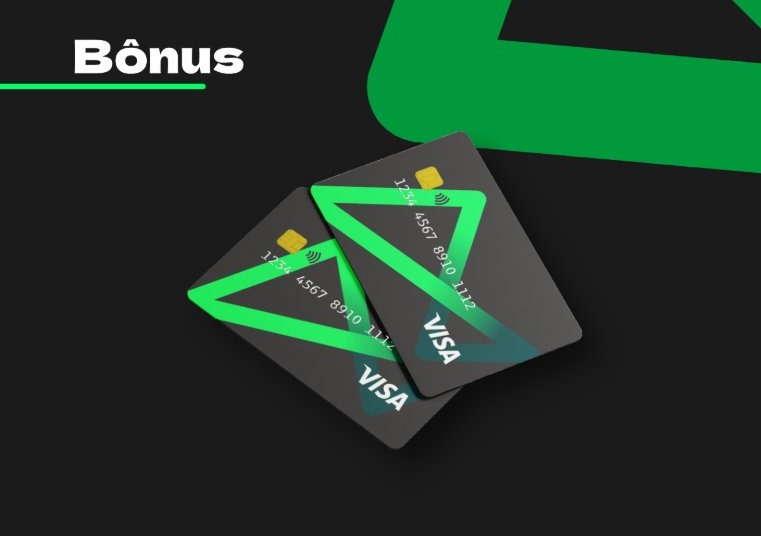
- Bonus: exploration of the physical card with the same graphics, showing coherence between digital and physical product.
STAGE 07Nielsen's heuristics applied
- Visibility of system status: balance, available limit and the month's invoice always in view.
- Recognition rather than recall: icon and label together on every service.
- Consistency and standards: one icon set, rounded corners and spacing across all screens.
- Aesthetic and minimalist design: one accent color and few type weights.
- User control and freedom: statement filters and hide balance.
STAGE 08Accessibility and next steps
The study handles main text contrast well. For a production version, these are the next steps:
- Define minimum touch targets (44 pt on iOS) and test the service tiles.
- Ensure Dynamic Type support (scalable text) for values and labels.
- Validate the dark brand green as text only at large sizes, or use the neon version.
- Run a usability test with 5 people on pay, transfer and view invoice, measuring time and errors.
LinksSee the full project